Summary: This blog post explores website color schemes, diving into color theory, tools for palette creation, and 50 examples across minimalist, vibrant, nature-inspired, retro, and monochrome categories. And also introduce a professional AI image enhancer helping your website more appealing.
Ever visited a website and instantly felt at ease—or overwhelmed? The color scheme likely played a big role. Colors aren't just decorative; they shape user experience, reinforce brand identity, and even drive conversions. Take Airbnb's coral-red accents, for example. They evoke warmth and trust, perfectly aligning with their mission to make travelers feel at home.
A well-chosen palette guides users to key elements, like call-to-action buttons, and helps your site stand out. In fact, 85% of shoppers say color influences their purchasing decisions. Whether you're designing a sleek SaaS platform or a vibrant e-commerce site, your color scheme is a strategic asset. Let's dive in!
Creating a website that not only looks good but also inspires trust and drives conversions requires attention to detail. Beyond color, the quality of your images matters. To ensure your visuals are crisp, clean, and professional, consider using Aiarty Image Enhancer to upscale and refine your photos and graphics before integrating them into your design. It can make a significant difference in the overall impact of your website.
Its advanced algorithms analyze images to minimize pixelation and enhance sharpness, resulting in clear, visually appealing assets.
This tool also reduces noise, removes artifacts, and sharpens edges, resulting in polished, professional-looking visuals, giving your design a clean and modern edge.
All of these ensures your website's photos and graphics look their absolute best, regardless of the device they're viewed on. It's like having a professional retoucher at your fingertips.
Download Aiarty Image Enhancer to give your website a polished and professional look.
Tools & Resources for Building Color Palettes
Creating the perfect color palette for your website doesn't have to be a guessing game. Thanks to a variety of online tools and resources, you can streamline the process and ensure your colors work harmoniously. Let's explore some of the best options available.
Color Palette Generators
These tools are lifesavers for designers and non-designers alike. They help you generate, test, and refine color schemes with ease.
- ColorCache: This versatile tool lets you create schemes from photos or base colors. You can even preview how your palette looks on live web pages in real-time. For instance, imagine applying Airbnb's coral-red to your mockup and seeing it come to life instantly. Plus, it allows you to reverse-engineer formulas from existing schemes, making it a go-to for inspiration.
- Website-Colors.com: If you're a fan of hands-on control, this tool lets you create 6-color palettes using hex or RGB sliders. You can save and compare different combinations, ensuring you find the perfect match for your brand.
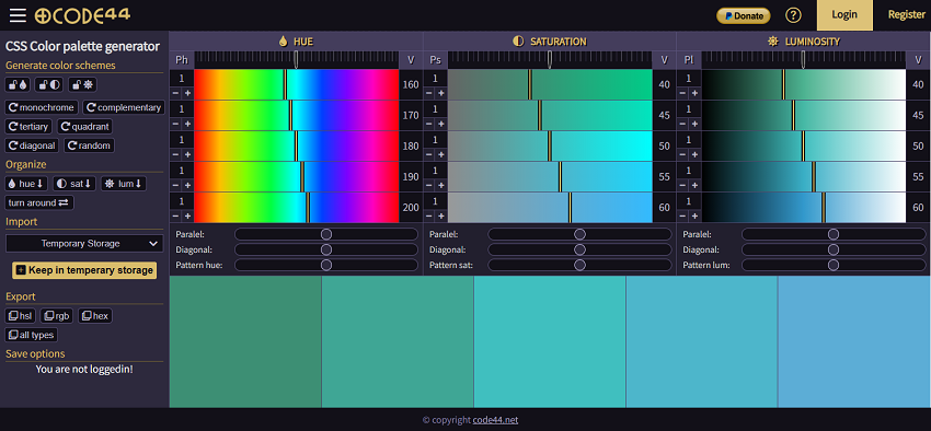
- CODE44 Palette Generator: Supporting HSL, RGB, and hex codes, this tool offers both random and custom palette generation. It's especially handy for creating gradients or monochromatic schemes.
- Coolors.co: This super-fast generator lets you lock in colors and press the spacebar to generate matching palettes. You can export your schemes in various formats, making it great for quick explorations and finding unexpected combinations.
- Figma: Figma is a collaborative web application for interface design. This plugin helps you generate a color palette for interface design. Personally I love this tool most. In the later part of 50 website color schemes, I also will use this tool to show you the color comination.

Extracting Colors from Photos
Sometimes, the best inspiration comes from the world around you. Tools like ColorCache's on-screen color picker let you harvest hues directly from images or live websites. Pair this with Visme's image picker, and you can create cohesive palettes that feel natural and balanced.
For example, if you're designing a wellness blog, you might extract soft terracotta tones from a serene desert photo. Or, for a tech startup, you could pull sleek metallic shades from a futuristic cityscape.
These tools not only save time but also ensure your color choices are intentional and effective. Ready to see some of the best website color schemes in action? Let's dive into the next section!
50 Best Website Color Schemes
Here's a curated list of 50 stunning color schemes, organized into categories to suit every style and purpose. Whether you're going for minimalist elegance or bold vibrancy, these palettes will spark your creativity.
Website Color Scheme Category 1. Minimalist & Clean
When it comes to website design, sometimes less is more. Minimalist color schemes focus on simplicity, clarity, and functionality, making them ideal for brands that want to convey professionalism and sophistication. These palettes often use neutral tones with subtle accents, creating a clean and uncluttered look that's easy on the eyes. Let's explore five standout examples and why they work so well.
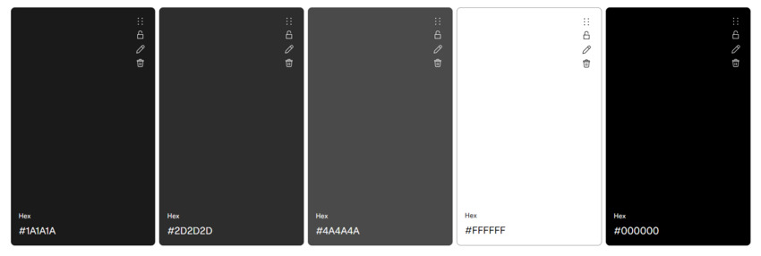
1. White + Soft Gray + Navy + Charcoal + Light Blue
Hex Codes: #FFFFFF, #F5F5F5, #2D3142, #1A1A1A, #E3F2FD
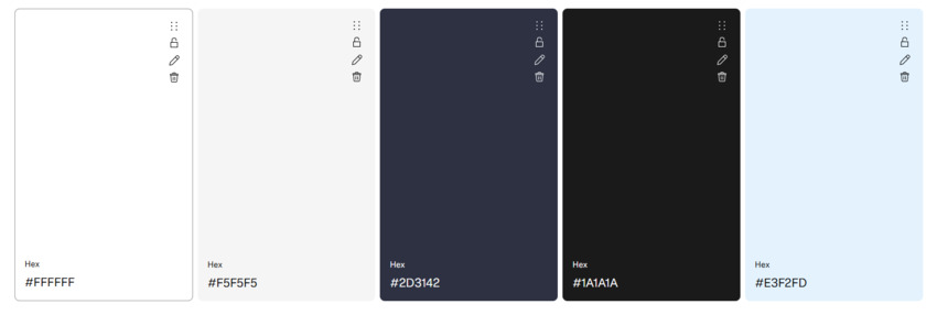
- Best For: SaaS platforms, productivity tools, and professional websites.
- Why It Works: This combination is all about balance. The white and soft gray create a clean, airy backdrop, while the navy adds depth and authority. It's a go-to for brands like Webflow, where clarity and professionalism are key.
2. Cream + Terracotta + Beige + Rust + Warm Gray
Hex Codes: #FFF5E6, #CC7357, #F0E1D2, #B34A30, #696969
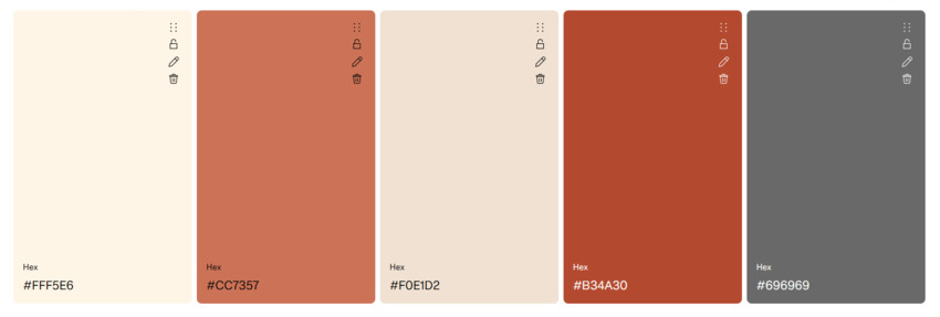
- Best For: Wellness blogs, lifestyle brands, and creative portfolios.
- Why It Works: Cream evokes warmth and comfort, while terracotta adds a touch of earthy sophistication. This palette is perfect for brands like Headspace, which aim to create a calming and inviting atmosphere.
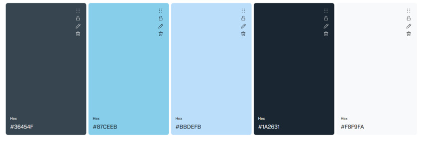
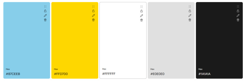
3. Pale Blue + Charcoal + Sky Blue + Midnight + Ice White
Hex Codes: #E3F2FD, #2C3E50, #87CEEB, #1A2631, #F0F8FF
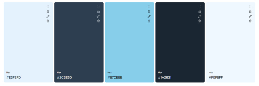
- Best For: Healthcare sites, professional services, and tech startups.
- Why It Works: Pale blue conveys calm and trust, making it a natural choice for healthcare or professional services. Paired with charcoal, it adds a modern, polished edge. Think of it as the digital equivalent of a crisp white lab coat.
4. Mint + Off-White + Pastel Mint + Slate + Light Gray
Hex Codes: #98FF98, #FDFDFD, #C8FAC8, #4A4A4A, #E0E0E0
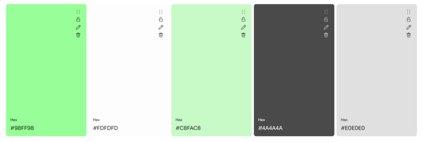
- Best For: Eco-friendly brands, lifestyle blogs, and creative agencies.
- Why It Works: Mint is fresh and invigorating, while off-white keeps the palette soft and approachable. This combo is perfect for brands that want to feel natural and modern. Pro tip: Use ColorCache to extract mint tones from nature photos for a cohesive look.
5. Warm Gray + Dusty Pink + Blush + Cream White + Medium Gray
Hex Codes: #696969, #E6B8B8, #FFD1DC, #F8F9FA, #808080
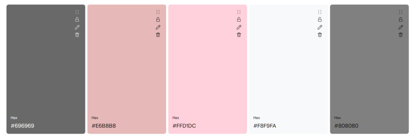
- Best For: Wedding industry sites, boutique brands, and lifestyle blogs.
- Why It Works: Warm gray is neutral and versatile, while dusty pink adds a touch of elegance and femininity. This palette is a 2024 trendsetter, especially for wedding industry websites that want to feel timeless yet modern.
Minimalist color schemes are all about creating a sense of calm and order. They're perfect for brands that want to let their content shine without overwhelming their audience. Ready to explore something bolder? Let's move on to the next category.
Website Color Scheme Category 2. Bold & Vibrant
If minimalist palettes are a quiet conversation, bold and vibrant color schemes are a full-blown party. These combos are all about energy, excitement, and making a statement. They're perfect for brands that want to stand out, evoke emotion, and leave a lasting impression. Let's dive into five eye-catching examples and why they're so effective.
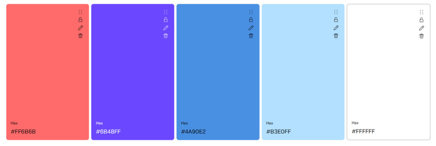
1. Electric Blue + Neon Pink + Violet + Gold + Dark Base
Hex Codes: #4A90E2, #FF6B6B, #6B48FF, #FFD700, #2D2D2D
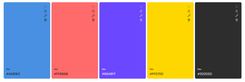
- Best For: Fitness apps, tech startups, and creative agencies.
- Why It Works: This high-contrast pairing is impossible to ignore. Electric blue brings a tech-savvy vibe, while neon pink adds a playful, energetic touch. Peloton uses this combo to motivate users and create a dynamic, high-energy interface.
2. Sunset Gradient (Coral + Peach + Amber + Royal Purple + Deep Indigo)
Hex Codes: #FF6B6B, #FF8E53, #FFB03A, #6B48FF, #4A34B3
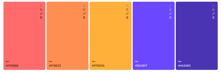
- Best For: Travel blogs, event websites, and creative portfolios.
- Why It Works: Gradients are a great way to add depth and movement to your design. This sunset-inspired palette evokes warmth and adventure, making it perfect for brands that want to inspire. Pro tip: Use CODE44's gradient editor to replicate this effect seamlessly.
3. Lime Green + Black + Chartreuse + Dark Gray + White
Hex Codes: #C8FF00, #000000, #A3D900, #333333, #FFFFFF
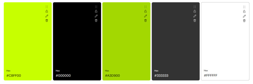
- Best For: Tech startups, gaming platforms, and edgy brands.
- Why It Works: Lime green is bold and futuristic, while black adds a sleek, modern edge. This combo is a favorite for brands like Discord, which aim to feel cutting-edge and youthful.
4. Hot Red + Gold + Tomato + Light Gold + Black
Hex Codes: #FF2400, #FFD700, #FF5349, #FFE55C, #1A1A1A
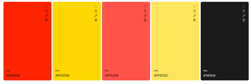
- Best For: Food delivery apps, e-commerce sites, and entertainment platforms.
- Why It Works: Red is attention-grabbing and appetite-stimulating, while gold adds a touch of luxury. Uber Eats uses this combo to create a sense of urgency and excitement around their service.
5. Acid Yellow + Deep Purple + Bright Yellow + Vivid Purple + Cream
Hex Codes: #FFF44F, #4B0082, #FFEA00, #6A0DAD, #F8F9FA
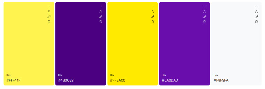
- Best For: Experimental fashion brands, creative agencies, and art platforms.
- Why It Works: This unexpected pairing is edgy and avant-garde. Acid yellow is bold and energetic, while deep purple adds depth and sophistication. It's a trendsetter for brands that want to push boundaries and stand out.
Bold and vibrant color schemes are perfect for brands that want to make a statement and evoke strong emotions. They're not for the faint of heart, but when done right, they can create a memorable and impactful user experience. Ready to explore something more grounded? Let's move on to the next category!
Website Color Scheme Category 3. Nature-Inspired
Nature-inspired color schemes bring the beauty of the outdoors into your website design. These palettes evoke feelings of calm, authenticity, and connection, making them perfect for brands that want to feel grounded, eco-friendly, or serene. Let's explore five stunning examples and why they work so well.
1. Forest Green + Beige + Pine Green + Cream + Olive
Hex Codes: #3D550C, #ECE7D5, #2E4608, #F5F0E6, #5A734A
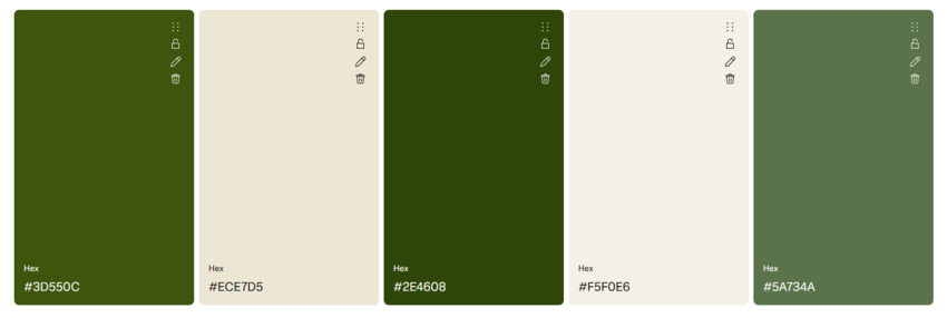
- Best For: Eco-friendly brands, outdoor retailers, and wellness blogs.
- Why It Works: Forest green is rich and earthy, symbolizing growth and sustainability, while beige adds warmth and balance. Patagonia uses this palette to reflect its commitment to the environment and outdoor adventure.
2. Ocean Blues (Turquoise + Cyan + Navy + Midnight Blue + Ice White)
Hex Codes: #40E0D0, #00B4D8, #003366, #001F3F, #F0F8FF
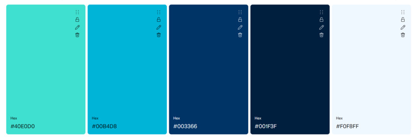
- Best For: Travel agencies, marine brands, and wellness platforms.
- Why It Works: Turquoise evokes the tranquility of tropical waters, while deep blue adds depth and professionalism. This combo is a favorite for travel brands like Airbnb Experiences, where it creates a sense of wanderlust and calm.
3. Desert Sand + Sage + Tan + Olive Drab + White Smoke
Hex Codes: #EDC9AF, #88B04B, #D2B48C, #6B8E23, #F8F8F8
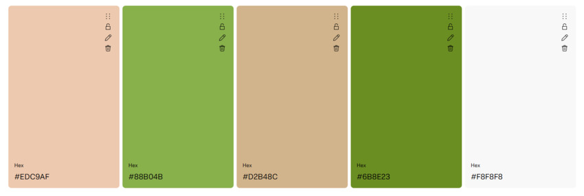
- Best For: Lifestyle blogs, eco-conscious brands, and creative portfolios.
- Why It Works: Desert sand is warm and inviting, while sage green adds a touch of freshness and vitality. This palette feels natural and approachable, making it ideal for brands that want to connect with their audience on a personal level. Pro tip: Use Visme's picker to extract these hues from photos for a cohesive look.
4. Autumn Hues (Burnt Orange + Bright Orange + Mustard + Soft Mustard + Charcoal)
Hex Codes: #CC5500, #FF6B00, #FFDB58, #FFE082, #2D2D2D
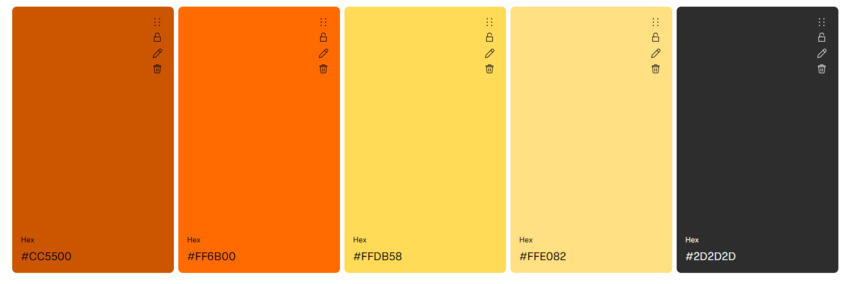
- Best For: Seasonal campaigns, lifestyle brands, and creative agencies.
- Why It Works: Burnt orange and mustard are warm and nostalgic, evoking the cozy feeling of fall. This palette is perfect for seasonal promotions, like REI Co-op's autumn campaigns, where it creates a sense of warmth and tradition.
5. Stormy Gray + Moss Green + Slate + Fresh Green + Light Gray
Hex Codes: #4A4A4A, #8A9A5B, #6B6B6B, #A3B86C, #F5F5F5
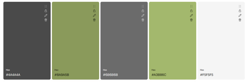
- Best For: Outdoor gear retailers, eco-friendly brands, and lifestyle blogs.
- Why It Works: Stormy gray is neutral and versatile, while moss green adds a natural, earthy touch. This combo is a favorite for outdoor brands that want to feel rugged yet approachable.
Nature-inspired color schemes are all about creating a sense of calm and connection. They're perfect for brands that want to feel authentic, grounded, and in tune with the natural world. Ready to explore something more nostalgic? Let's move on to the next category!
Website Color Scheme Category 4. Retro & Vintage
Retro and vintage color schemes are all about nostalgia, charm, and personality. These palettes draw inspiration from past decades, evoking a sense of timelessness and creativity. They're perfect for brands that want to stand out with a unique, nostalgic vibe. Let's dive into five standout examples and why they're so effective.
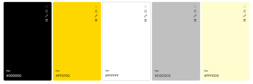
1. 70s Mustard + Avocado Green + Walnut + Cream + Off-White
Hex Codes: #FFD700, #568203, #8B5A2B, #FFFDD0, #F8F8F8
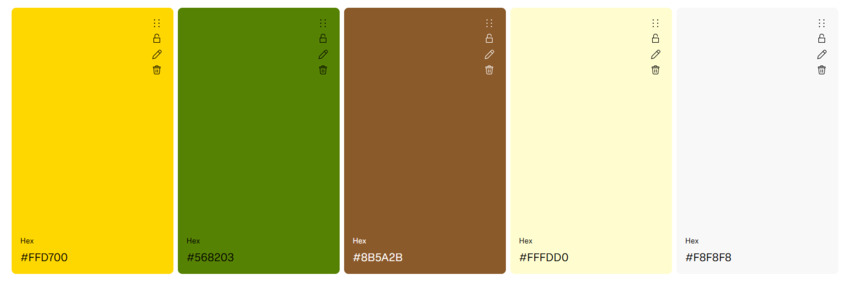
- Best For: Vinyl record stores, retro cafes, and lifestyle blogs.
- Why It Works: This combo screams 1970s charm. Mustard yellow is warm and inviting, while avocado green adds a touch of earthy sophistication. It's perfect for brands that want to channel retro vibes and create a sense of nostalgia.
2. Retro Pink + Teal + Light Pink + Dark Teal + Light Gray
Hex Codes: #FF69B4, #008080, #FFB6C1, #006666, #E0E0E0
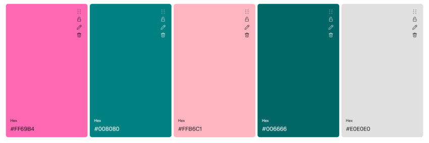
- Best For: Gaming platforms, creative agencies, and lifestyle brands.
- Why It Works: Retro pink is playful and fun, while teal adds a cool, modern edge. This palette is a favorite for nostalgic gaming platforms that want to feel both retro and fresh.
3. Sepia + Cream + Walnut + Ivory + Charcoal
Hex Codes: #704214, #FFFDD0, #8B5A2B, #FFFFF0, #1A1A1A
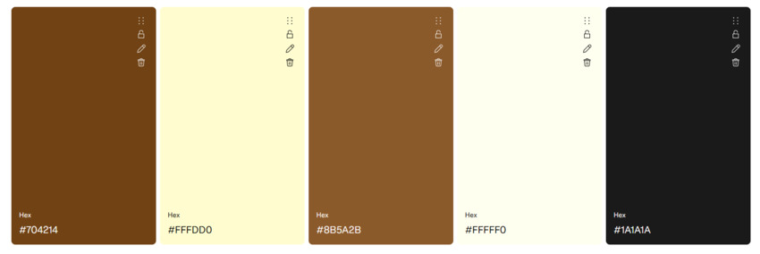
- Best For: Historical archives, museums, and vintage-inspired brands.
- Why It Works: Sepia evokes the look of aged photographs, creating a timeless and classic feel. Paired with cream, it's warm and approachable, making it ideal for brands that want to feel nostalgic and elegant.
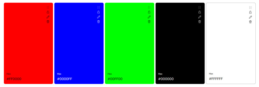
4. Psychedelic Rainbow (Red + Orange + Yellow + Green + Blue)
Hex Codes: #FF0000, #FFA500, #FFFF00, #00FF00, #0000FF
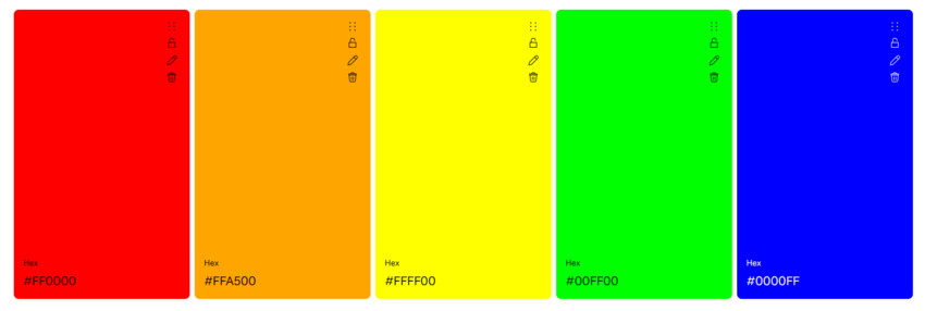
- Best For: Music festival sites, creative portfolios, and experimental brands.
- Why It Works: This vibrant gradient is a nod to the psychedelic art of the 1960s. It's bold, energetic, and impossible to ignore, making it perfect for brands like Coachella that want to feel fun and unconventional.
5. Mid-Century Modern (Olive + Coral + Mustard + Cream + Charcoal)
Hex Codes: #808000, #FF7F50, #FFD700, #FFFDD0, #1A1A1A
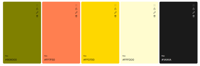
- Best For: Interior design blogs, lifestyle brands, and creative agencies.
- Why It Works: Olive green is earthy and sophisticated, while coral adds a pop of warmth and energy. This palette is inspired by mid-century modern design, making it perfect for brands that want to feel timeless yet fresh. Pro tip: Test this combo with Website-Colors.com's sliders to fine-tune the shades.
Retro and vintage color schemes are all about celebrating the past while adding a modern twist. They're perfect for brands that want to stand out with a unique, nostalgic vibe. Ready to explore something more sleek and cohesive? Let's move on to the next category!
Website Color Scheme Category 5. Monochrome Magic
Monochrome color schemes are the epitome of sophistication and simplicity. By using variations of a single color, these palettes create a cohesive, polished look that's both elegant and easy to navigate. They're perfect for brands that want to feel sleek, modern, and timeless. Let's explore five stunning examples and why they work so well.
1. Black + White + Red Accent + Gray + Light Gray
Hex Codes: #000000, #FFFFFF, #FF0000, #808080, #E0E0E0
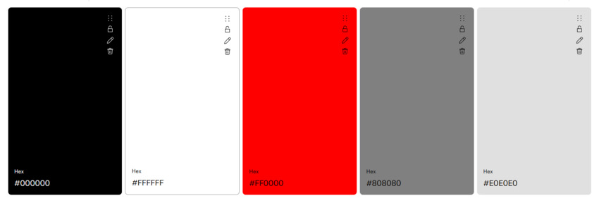
- Best For: Photography portfolios, editorial websites, and luxury brands.
- Why It Works: Black and white is a classic combo that exudes sophistication, while a pop of red adds drama and focus. Magnum Photos uses this palette to let their stunning imagery take center stage.
2. Shades of Blue (Ice Blue + Powder Blue + Baby Blue + Dodger Blue + Navy)
Hex Codes: #E6F4F1, #B3E0FF, #89CFF0, #1E90FF, #000080
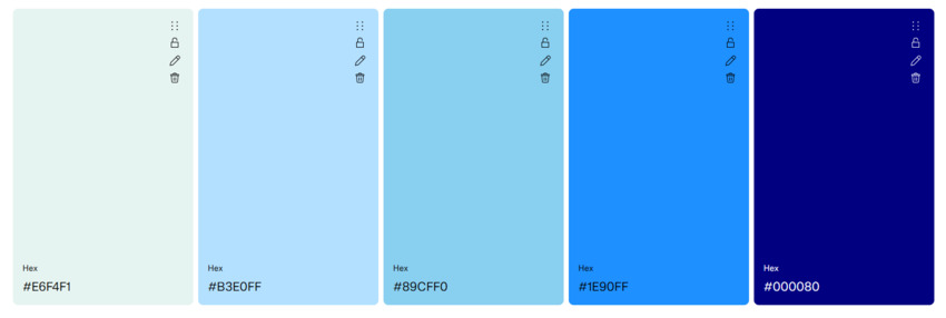
- Best For: Professional platforms, tech startups, and corporate websites.
- Why It Works: Blue is synonymous with trust and reliability. This gradient of soft to deep blues is perfect for brands like LinkedIn, where professionalism and approachability are key.
3. Grayscale + Pop of Yellow (Charcoal + Gray + Silver + Light Gray + Gold
Hex Codes: #333333, #666666, #999999, #CCCCCC, #FFD700
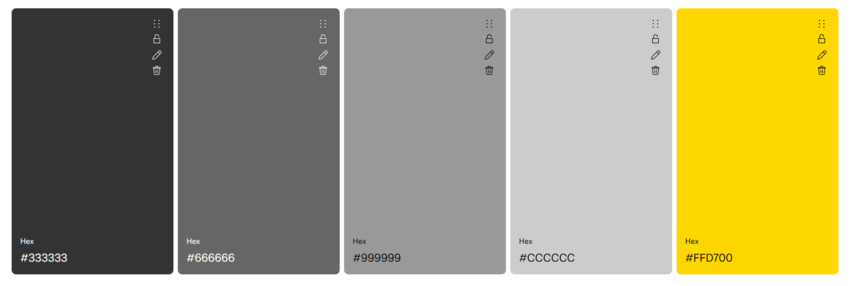
- Best For: Finance apps, tech platforms, and minimalist brands.
- Why It Works: Grayscale creates a clean, modern base, while yellow adds a touch of optimism and energy. Finance apps like Mint use this combo to balance trust with a sense of positivity.
4. All-Pink Palette (Pink + Light Pink + Hot Pink + Deep Pink + Burgundy)
Hex Codes: #FFC0CB, #FFB6C1, #FF69B4, #FF1493, #8B0A50
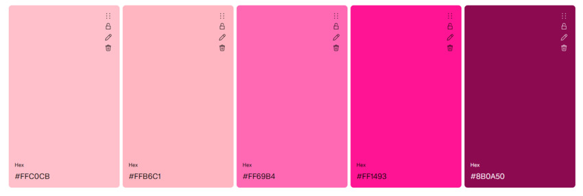
- Best For: Beauty brands, lifestyle blogs, and creative portfolios.
- Why It Works: Pink is playful, feminine, and eye-catching. This monochrome palette is perfect for brands like Glossier, which aim to feel fresh, modern, and approachable.
5. Deep Purple Tones (Lavender + Medium Purple + Blue Violet + Indigo + Black)
Hex Codes: #E6E6FA, #9370DB, #8A2BE2, #4B0082, #1A1A1A
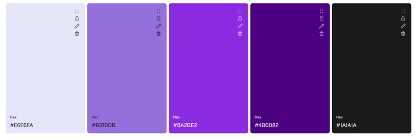
- Best For: Luxury brands, creative agencies, and wellness platforms.
- Why It Works: Purple is associated with creativity and luxury. This gradient of soft lavender to deep plum creates a sense of depth and sophistication. Pro tip: Use CODE44's monochrome tool to experiment with different shades.
Monochrome color schemes are all about simplicity and elegance. They're perfect for brands that want to create a polished, cohesive look without overwhelming their audience. Ready to explore something more professional? Let's move on to the next category!
Website Color Scheme Category 6. Corporate & Professional
When it comes to corporate and professional websites, the color scheme needs to convey trust, reliability, and sophistication. These palettes are often understated yet impactful, making them perfect for businesses, institutions, and brands that want to project authority and credibility. Let's explore five standout examples and why they're so effective.
1. Navy + Gold + White + Charcoal + Sky Blue
Hex Codes: #0A2647, #D4AF37, #FFFFFF, #1A1A1A, #87CEEB
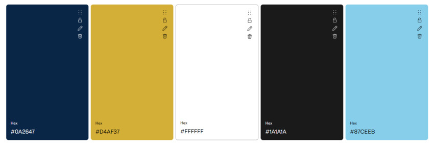
- Best For: Financial institutions, professional services, and luxury brands.
- Why It Works: Navy exudes trust and stability, while gold adds a touch of elegance and prestige. White keeps the palette clean and professional. LinkedIn's polished aesthetic is a perfect example of this combo in action.
2. Slate Gray + Teal + Light Gray + Dark Teal + Ice White
Hex Codes: #2F4F4F, #008080, #E0E0E0, #006666, #F0F8FF
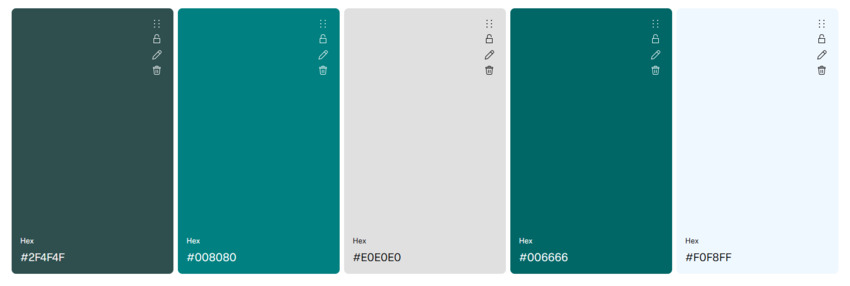
- Best For: Tech companies, consulting firms, and corporate websites.
- Why It Works: Slate gray is neutral and professional, while teal adds a modern, tech-savvy edge. This palette is a favorite for brands like IBM, where balance and innovation are key.
3. Maroon + Cream + Walnut + Ivory + Charcoal
Hex Codes: #800000, #F5F5DC, #8B5A2B, #FFFFF0, #4A4A4A
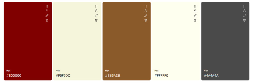
- Best For: Academic institutions, legal firms, and traditional brands.
- Why It Works: Maroon is rich and authoritative, while cream adds warmth and approachability. This classic combo is used by institutions like Harvard University to convey tradition and credibility.
4. Dark Green + Beige + Olive + Cream + White Smoke
Hex Codes: #1B4D3E, #F5E6CA, #556B2F, #FFFDD0, #F8F9FA
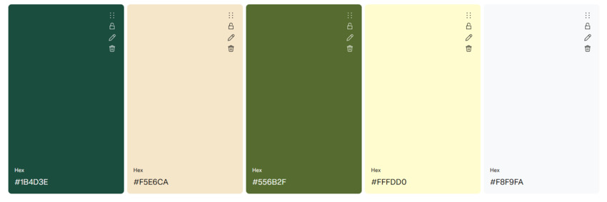
- Best For: Sustainability reports, eco-conscious brands, and corporate ESG initiatives.
- Why It Works: Dark green symbolizes growth and sustainability, while beige keeps the palette soft and approachable. It's a go-to for brands that want to highlight their eco-credibility.
5. Charcoal + Sky Blue + Light Blue + Midnight + White
Hex Codes: #36454F, #87CEEB, #BBDEFB, #1A2631, #FFFFFF
- Best For: Tech startups, professional services, and corporate dashboards.
- Why It Works: Charcoal is sleek and modern, while sky blue adds a touch of calm and clarity. This combo is perfect for creating a professional yet approachable look. Pro tip: Use CODE44's HSL sliders to soften contrasts and fine-tune the shades.
Corporate and professional color schemes are all about creating a sense of trust and authority. They're perfect for brands that want to project credibility while maintaining a modern, polished aesthetic. Ready to explore something more luxurious? Let's move on to the next category!
Website Color Scheme Category 7. Luxury & Elegance
Luxury and elegance go hand in hand with sophistication, exclusivity, and timeless appeal. These color schemes are perfect for high-end brands that want to convey opulence and refinement. Think of rich, deep hues paired with metallic accents or soft neutrals that exude class. Let's explore five stunning examples and why they work so well.
1. Black + Gold + White + Silver + Cream
Hex Codes: #000000, #FFD700, #FFFFFF, #C0C0C0, #FFFDD0
- Best For: Luxury brands, jewelry websites, and high-end fashion.
- Why It Works: Black is sleek and powerful, gold adds a touch of opulence, and white keeps the palette clean and elegant. Rolex's timeless aesthetic is a prime example of this combo in action.
2. Deep Purple + Silver + Lavender + Ice White + Charcoal
Hex Codes: #4B0082, #C0C0C0, #E6E6FA, #F0F8FF, #1A1A1A
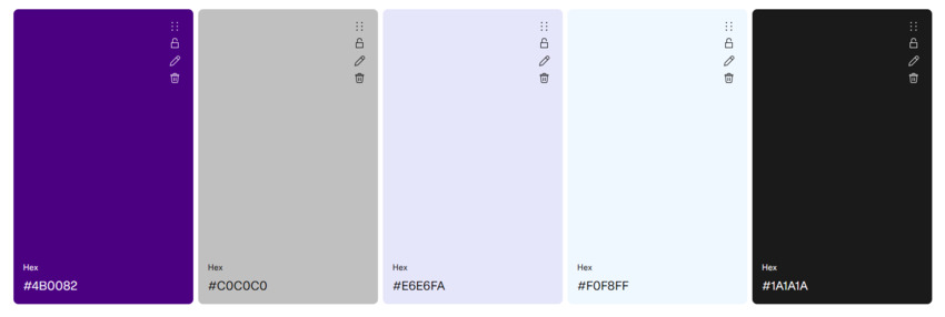
- Best For: Jewelry brands, holiday campaigns, and premium services.
- Why It Works: Deep purple is associated with royalty and luxury, while silver adds a modern, sophisticated edge. Tiffany & Co.'s holiday campaigns often use this palette to create a sense of exclusivity.
3. Burgundy + Cream + Walnut + Ivory + Dark Gray
Hex Codes: #800020, #FFFDD0, #8B5A2B, #FFFFF0, #333333
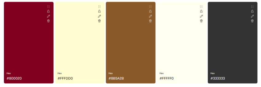
- Best For: High-end fashion, editorial layouts, and luxury hospitality.
- Why It Works: Burgundy is rich and dramatic, while cream adds warmth and balance. This combo is perfect for brands like Gucci, where it creates a sense of elegance and sophistication.
4. Emerald Green + Gold + Olive + Light Gold + Black
Hex Codes: #046307, #D4AF37, #556B2F, #FFE55C, #000000
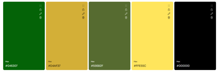
- Best For: Jewelry brands, luxury real estate, and high-end events.
- Why It Works: Emerald green is lush and luxurious, while gold adds a regal touch. This palette is a favorite for brands like Cartier, where it creates a sense of timeless elegance.
5. Midnight Blue + Rose Gold + Lavender + Cream + Charcoal
Hex Codes: #191970, #E6B8B8, #E6E6FA, #FFFDD0, #1A1A1A
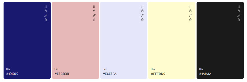
- Best For: Luxury tech, high-end beauty, and premium lifestyle brands.
- Why It Works: Midnight blue is deep and mysterious, while rose gold adds a modern, feminine touch. This combo is perfect for creating a luxurious yet approachable aesthetic. Pro tip: Preview metallic accents with ColorCache's live mockups to see how they'll look in real-time.
Luxury and elegance color schemes are all about creating a sense of exclusivity and refinement. They're perfect for brands that want to project sophistication and timeless appeal. Ready to explore something more playful? Let's move on to the next category!
Website Color Scheme Category 8. Playful & Whimsical
Playful and whimsical color schemes are all about fun, creativity, and energy. These palettes are perfect for brands that want to feel youthful, vibrant, and approachable. Think bright, bold hues and unexpected combinations that spark joy and curiosity. Let's dive into five standout examples and why they work so well.
1. Rainbow Gradient (Red + Orange + Yellow + Green + Blue)
Hex Codes: #FF0000, #FFA500, #FFFF00, #00FF00, #0000FF
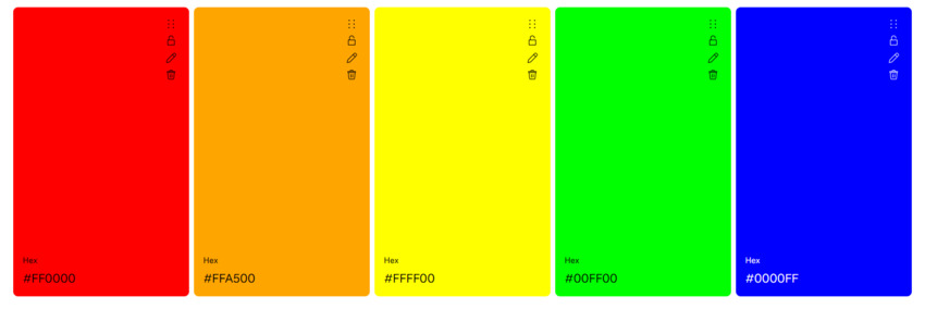
- Best For: Creative platforms, gaming websites, and youth-focused brands.
- Why It Works: This vibrant gradient is a celebration of color and energy. It's perfect for brands like TikTok, where it creates a sense of fun and endless possibilities.
2. Bubblegum Pink + Lime Green + White + Black + Light Pink
Hex Codes: #FF69B4, #32CD32, #FFFFFF, #000000, #FFB6C1
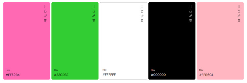
- Best For: Language apps, toy brands, and lifestyle platforms.
- Why It Works: Bubblegum pink is playful and fun, while lime green adds a fresh, energetic vibe. Duolingo's interface is a great example of how this combo can feel both youthful and engaging.
3. Sky Blue + Sunshine Yellow + White + Light Gray + Charcoal
Hex Codes: #87CEEB, #FFD700, #FFFFFF, #E0E0E0, #1A1A1A
- Best For: Toy brands, educational platforms, and creative agencies.
- Why It Works: Sky blue is calming and approachable, while sunshine yellow adds a burst of optimism. This palette is perfect for brands like LEGO, where it creates a sense of creativity and joy.
4. Pastel Rainbow (Pink + Peach + Yellow + Mint + Lavender)
Hex Codes: #FFB3BA, #FFDFBA, #FFFFBA, #BAFFC9, #BAE1FF
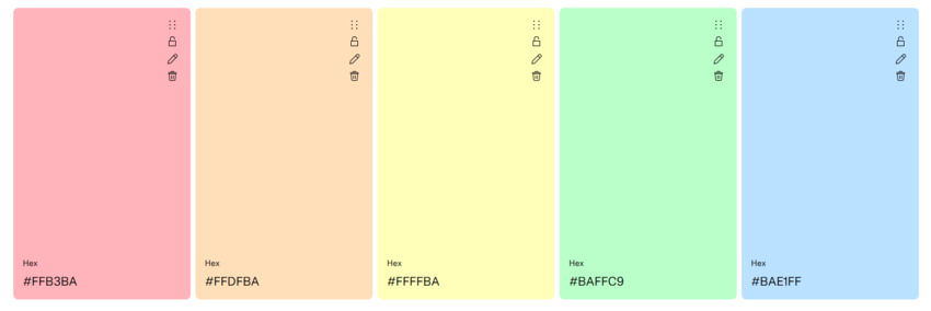
- Best For: Lifestyle blogs, beauty brands, and creative portfolios.
- Why It Works: Pastels are soft and soothing, yet still playful and fun. This palette is perfect for brands that want to feel approachable and whimsical. Pro tip: Create soft gradients with Visme's palette generator for a cohesive look.
5. Neon Orange + Electric Blue + White + Black + Light Blue
Hex Codes: #FF6700, #00FFFF, #FFFFFF, #000000, #B3E0FF

- Best For: Gaming platforms, tech startups, and edgy brands.
- Why It Works: Neon orange is bold and energetic, while electric blue adds a futuristic edge. This combo is a favorite for gaming platforms like Twitch, where it creates a high-energy, immersive experience.
Playful and whimsical color schemes are all about creating a sense of fun and creativity. They're perfect for brands that want to feel vibrant, approachable, and full of life. Ready to explore something more futuristic? Let's move on to the next category!
Website Color Scheme Category 9. Tech/Futuristic
Tech and futuristic color schemes are sleek, modern, and forward-thinking. These palettes often feature bold, high-contrast combinations and metallic or gradient effects that evoke innovation and cutting-edge design. They're perfect for tech startups, gaming platforms, and brands that want to feel ahead of the curve. Let's explore five standout examples and why they work so well.
1. Cyberpunk (Neon Blue + Hot Pink + Black + Purple + White)
Hex Codes: #00FFFF, #FF00FF, #000000, #6B48FF, #FFFFFF
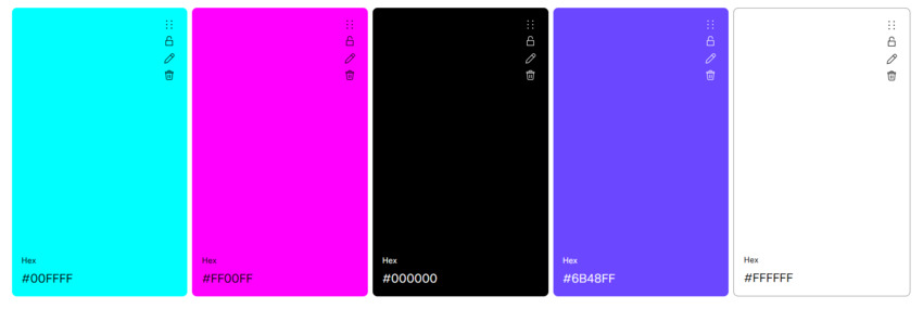
- Best For: Gaming websites, tech startups, and edgy brands.
- Why It Works: This high-contrast combo is bold and futuristic, perfect for creating an immersive, high-energy experience. Cyberpunk 2077's promo site is a prime example of this edgy palette in action.
2. Metallic Silver + Electric Blue + Charcoal + Ice White + Light Gray
Hex Codes: #C0C0C0, #0066CC, #1A1A1A, #F0F8FF, #E0E0E0
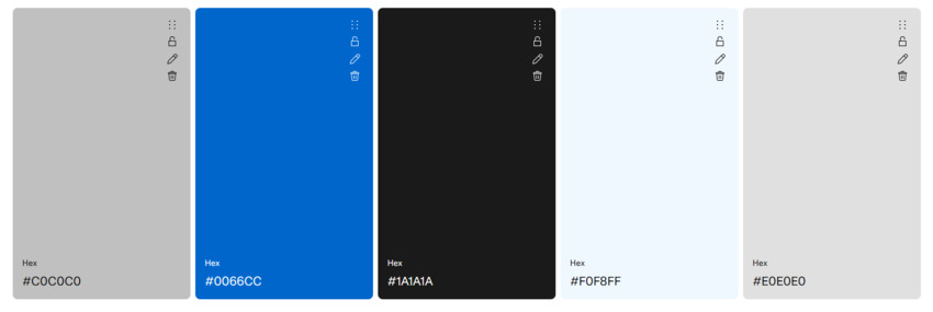
- Best For: AI startups, tech dashboards, and innovative platforms.
- Why It Works: Metallic silver is sleek and modern, while electric blue adds a tech-savvy edge. This palette is perfect for brands like OpenAI, where it creates a sense of innovation and professionalism.
3. Dark Mode Gradient (Charcoal + Slate + Light Gray + White + Black)
Hex Codes: #1A1A1A, #2D2D2D, #4A4A4A, #FFFFFF, #000000
- Best For: Space-themed apps, tech platforms, and minimalist brands.
- Why It Works: Dark mode is sleek, modern, and easy on the eyes. This gradient creates depth and sophistication, making it ideal for brands like SpaceX, where it evokes a sense of mystery and innovation.
4. Holographic (Shifting Gradient: Coral + Purple + Blue)
Hex Codes: #FF6B6B, #6B48FF, #4A90E2, #B3E0FF, #FFFFFF
- Best For: Creative platforms, tech startups, and futuristic brands.
- Why It Works: Holographic gradients are dynamic and eye-catching, perfect for brands that want to feel cutting-edge. Pro tip: Use CODE44's CSS gradient editor to create seamless, shifting effects.
5. Glitch Effect (Red + Blue + Green + Black + White)
Hex Codes: #FF0000, #0000FF, #00FF00, #000000, #FFFFFF
- Best For: AR/VR platforms, gaming websites, and experimental brands.
- Why It Works: This bold, high-contrast combo mimics the glitch effect often seen in digital art. It's perfect for brands that want to feel edgy and unconventional.
Tech and futuristic color schemes are all about innovation and modernity. They're perfect for brands that want to project a cutting-edge, forward-thinking image. Ready to explore something more seasonal? Let's move on to the next category!
Website Color Scheme Category 10. Seasonal & Event-Driven
Seasonal and event-driven color schemes are all about capturing the mood and spirit of a specific time or occasion. Whether it's the warmth of summer, the coziness of winter, or the excitement of a holiday, these palettes help brands connect with their audience on a timely and emotional level. Let's explore five standout examples and why they work so well.
1. Christmas (Red + Green + Gold + White + Charcoal)
Hex Codes: #B22222, #228B22, #D4AF37, #FFFFFF, #1A1A1A
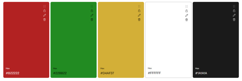
- Best For: Holiday campaigns, e-commerce sites, and festive promotions.
- Why It Works: Red and green are classic Christmas colors, evoking warmth and celebration, while gold adds a touch of luxury. Amazon's holiday sale banners are a great example of this palette in action.
2. Halloween (Orange + Black + Purple + White + Gray)
Hex Codes: #FF6700, #000000, #800080, #FFFFFF, #808080
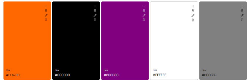
- Best For: Spooky campaigns, event websites, and creative portfolios.
- Why It Works: Orange and black are synonymous with Halloween, creating a sense of fun and mystery, while purple adds a touch of drama. Netflix's October headers often use this combo to set the mood for spooky season.
3. Valentine's Day (Pink + Red + White + Light Pink + Charcoal)
Hex Codes: #FF69B4, #FF0000, #FFFFFF, #FFB6C1, #1A1A1A
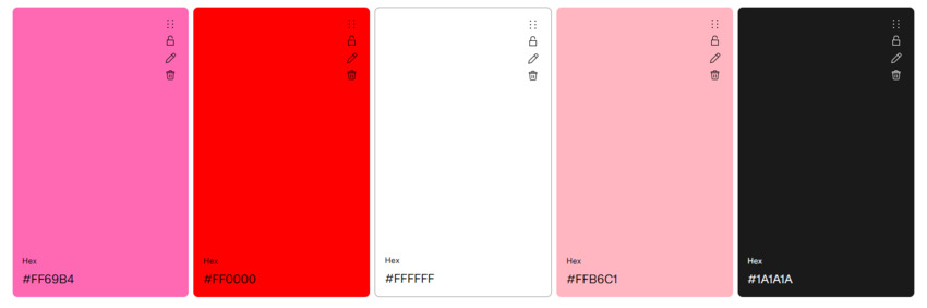
- Best For: E-commerce sites, lifestyle brands, and romantic campaigns.
- Why It Works: Pink and red are the colors of love and passion, while white keeps the palette soft and romantic. This combo is perfect for brands like Etsy, where it creates a sense of warmth and connection.
4. Spring Pastels (Mint + Lavender + Peach + Yellow + White)
Hex Codes: #98FF98, #E6E6FA, #FFDAB9, #FFFFBA, #FFFFFF
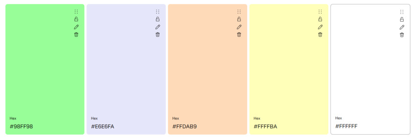
- Best For: Seasonal campaigns, lifestyle blogs, and creative portfolios.
- Why It Works: Mint and lavender are soft and fresh, evoking the renewal and beauty of spring.
5. Summer Vibes (Turquoise + Coral + Yellow + White + Light Gray)
Hex Codes: #40E0D0, #FF7F50, #FFD700, #FFFFFF, #E0E0E0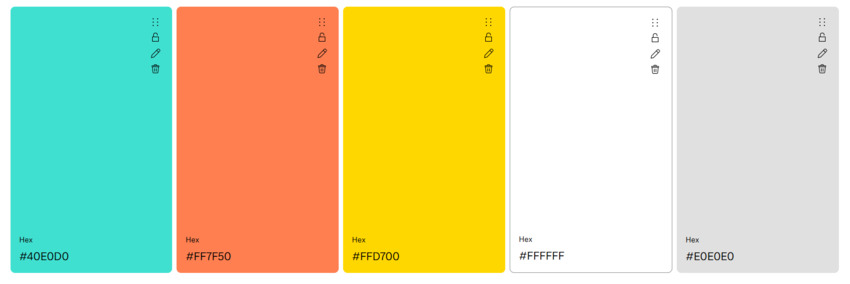
- Best For: Travel booking sites, lifestyle brands, and seasonal promotions.
- Why It Works: Turquoise evokes the ocean and sunny skies, while coral adds a pop of warmth and energy. This palette is perfect for brands like Booking.com, where it creates a sense of adventure and relaxation.
Seasonal and event-driven color schemes are all about capturing the essence of a moment. They're perfect for brands that want to connect with their audience on a timely and emotional level.
Choosing the Best Background Color for Your Website
Whether you're going for a clean, minimalist look or something bold and immersive, the right background color can make all the difference. Let's break down the key considerations to help you make the best choice.
Light vs. Dark Backgrounds
The first decision you'll need to make is whether to go with a light or dark background. Each has its own strengths and can dramatically impact the user experience.
Light Backgrounds:
- Best For: Readability, professional websites, and minimalist designs.
- Why It Works: Light backgrounds, like white (#FFFFFF), create a clean, airy feel that's easy on the eyes. They're perfect for text-heavy sites or platforms like Medium, where readability is key.
- Pro Tip: Pair a light background with dark text for maximum contrast and accessibility.
Dark Backgrounds:
- Best For: Luxury brands, creative portfolios, and immersive experiences.
- Why It Works: Dark backgrounds, like charcoal (#2D2D2D), create a sleek, sophisticated look. They're ideal for brands like Rolex, where they add a sense of exclusivity and elegance.
- Pro Tip: Use light text and vibrant accents to make your content pop against a dark background.
Text-Contrast Best Practices
No matter which background color you choose, ensuring proper contrast between your text and background is crucial for readability and accessibility.
- Follow WCAG Guidelines: The Web Content Accessibility Guidelines (WCAG) recommend a contrast ratio of at least 4.5:1 for normal text and 3:1 for large text. This ensures your content is readable for all users, including those with visual impairments.
- Test Your Contrast: Use tools like WebAIM's contrast checker to test your color combinations and ensure they meet accessibility standards.
Consider Your Brand and Audience
Your background color should align with your brand identity and resonate with your target audience. For example:
- A wellness blog might opt for soft, calming colors like pale blue or cream.
- A tech startup might go for a sleek, dark background with vibrant accents.
- A luxury brand might choose a rich, deep color like navy or burgundy.
Lastly, don't be afraid to test different background colors and see how they impact your design. Use tools like ColorCache or Website-Colors.com to preview your palette in real-time and make adjustments as needed.
Common Mistakes to Avoid When Choosing Website Color Schemes
Even the most beautiful color schemes can fall flat if you make a few critical mistakes. Whether you're designing a website from scratch or revamping an existing one, it's important to steer clear of these common pitfalls. Let's break them down so you can create a design that's both stunning and effective.
Overloading Colors
One of the biggest mistakes is using too many colors. A cluttered palette can overwhelm users and make your site feel chaotic.
- Example: Imagine an e-commerce site with eight or more colors competing for attention. It's hard to know where to look, and the overall experience feels disjointed.
- Solution: Stick to a limited palette of 3-5 colors. Use one dominant color, a secondary color, and an accent color for balance.
Ignoring Cultural Associations
Colors carry different meanings in different cultures. What's positive in one context might be negative in another.
- Example: In Western cultures, white symbolizes purity and simplicity. But in some Eastern cultures, it's associated with mourning.
- Solution: Research your target audience and ensure your color choices align with their cultural norms and preferences.
Neglecting Accessibility
A beautiful design is useless if it's not accessible to everyone. Poor contrast or color choices can make your site difficult to navigate for users with visual impairments.
- Example: Light gray text on a white background might look sleek, but it's nearly impossible to read.
- Solution: Follow WCAG guidelines for contrast and test your design with tools like WebAIM's contrast checker.
Forgetting the Psychology of Colors
Colors evoke emotions and associations, and ignoring this can lead to a disconnect between your brand and your audience.
- Example: Using red for a wellness blog might feel jarring, as red is often associated with urgency or danger.
- Solution: Choose colors that align with your brand's message and the emotions you want to evoke.
Not Testing on Different Devices
Your color scheme might look great on your desktop monitor but fall apart on a mobile screen or under different lighting conditions.
- Example: A dark background with light text might look sleek on a high-resolution screen but become hard to read on a phone in bright sunlight.
- Solution: Test your design on multiple devices and in various lighting conditions to ensure consistency and readability.
Ignoring Trends (or Following Them Blindly)
While it's important to stay updated on design trends, blindly following them can make your site feel generic.
- Example: Using a trendy neon palette just because it's popular, even if it doesn't align with your brand.
- Solution: Use trends as inspiration, but always prioritize what's best for your brand and audience.
By avoiding these common mistakes, you can create a color scheme that's not only visually appealing but also functional, accessible, and aligned with your brand.
Final Tips & Takeaways
Choosing the perfect website color scheme is both an art and a science. Here are some quick tips to help you nail it:
- Start Simple: Begin with a base color that reflects your brand, then build your palette around it. Tools like Canva's templates can help you experiment.
- Stay Trendy: Keep an eye on trends—muted pastels with metallic accents are big for 2025.
- Test Everywhere: Use tools like ColorCache to preview your palette on different devices and lighting conditions.
- Prioritize Accessibility: Follow WCAG guidelines and use WebAIM's contrast checker to ensure readability for all users.
- Keep It Clean: Stick to 3-5 colors to avoid overwhelming your audience.
- Align with Your Brand: Choose colors that evoke the right emotions and align with your brand's personality.
- Iterate and Improve: Gather feedback and be open to tweaking your palette for a better user experience.
- Have Fun: Don't be afraid to experiment with bold, unexpected combinations.
You May Also Like
This post was written by Brenda Peng who is a seasoned editor at Digiarty Software who loves turning ordinary photos into extraordinary works of art. With AI assistance for brainstorming and drafting, the post is reviewed for accuracy by our expert Abby Poole for her expertise in this field.